Elements of a Successful Newsletter Design
1. Newsletter Logo Design

Your newsletter logo is a crucial part of your brand identity. It should be prominent and consistent with your overall branding. The logo is often the first thing that readers notice, and it sets the tone for the entire newsletter. Therefore, it’s essential to design a logo that is simple yet recognizable. The colors should align with your brand’s palette, ensuring consistency across all your marketing materials. Additionally, make sure your logo looks good on different devices, as your audience will be accessing your newsletter from various platforms. A responsive design ensures that your logo maintains its quality and impact, whether viewed on a desktop, tablet, or smartphone. For inspiration, you can visit UseINBOX's newsletter design page.
2. Newsletter Design Email Layout
The layout of your email newsletter should be clean and organized. A well-structured layout helps guide the reader through your content seamlessly. Think of your layout as the blueprint of your newsletter; it dictates how information is presented and navigated. Using a grid system can help align your content, providing a balanced and professional appearance. Prioritizing information with a clear hierarchy ensures that your most important messages are highlighted. Furthermore, incorporating plenty of white space avoids clutter and makes the newsletter more readable. A clean layout not only enhances aesthetic appeal but also improves the overall user experience. UseINBOX provides excellent templates and tools to help you create a flawless layout.
Designing an Engaging Newsletter Page Layout
4. Newsletter Page Layout Tips 
An engaging layout keeps your readers interested and encourages them to take action. Here are some tips for designing a compelling layout: Use headings and subheadings to break up text, making it easier for readers to scan the content. Including images and graphics can support your message and make the newsletter visually appealing. Call-to-action buttons should be strategically placed to guide readers towards desired actions, such as visiting your website or making a purchase. A well-designed layout not only looks good but also enhances functionality, making it easier for readers to engage with your content. For more tips, visit the UseINBOX blog.
6. Newsletter Design Samples and Inspiration

Looking at design samples can spark creativity. Here are some places to find inspiration: Design galleries like Behance and Dribbble showcase a wide range of creative work from designers around the world. These platforms can provide insights into current trends and innovative design approaches. Email design showcase websites often feature examples of effective newsletter designs, highlighting successful layouts, color schemes, and content strategies. Additionally, reviewing competitor newsletters can offer valuable insights into what works well in your industry. Drawing inspiration from these sources can help you develop a unique and effective newsletter design. For more inspiration, check out UseINBOX's newsletter design ideas.
Creating a Newsletter Design Template
7. Newsletter Design Template Benefits

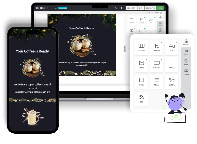
Using a template can save time and ensure consistency. Templates provide a predefined structure that can be customized to fit different campaigns. They ensure that your branding remains consistent across all newsletters, creating a cohesive look that strengthens brand identity. Additionally, templates give your newsletters a professional appearance, making them more attractive to your audience. By using a template, you can streamline the design process, allowing you to focus on creating compelling content. UseINBOX offers a variety of customizable templates to help you get started.
8. Newsletter Design Ideas to Try

Experiment with various design ideas to see what works best for your audience: Minimalist designs, characterized by clean lines and ample white space, can create a sophisticated and modern look. Bold and colorful designs can grab attention and convey energy, making them ideal for promotions or announcements. Themed designs, tailored for specific occasions like holidays or events, can make your newsletters more relevant and engaging. Trying out different design ideas can help you discover what resonates most with your audience and meets your campaign objectives. For more creative ideas, visit UseINBOX's newsletter design inspiration.
9. Newsletter Best Design Practices

Follow best practices to ensure your newsletter is effective: Optimize your newsletter for mobile devices, as a significant portion of your audience will access it on their smartphones or tablets. Use alt text for images to improve accessibility and ensure that your content is still understandable if images do not load. Testing different versions of your newsletter can provide insights into what designs and content perform best. By adhering to best practices, you can enhance the effectiveness of your newsletters and achieve better engagement rates. UseINBOX provides tools and tips to help you implement these best practices effectively.
Newsletter Layout Sample and Creative Designs
10. Newsletter Layout Sample Examples

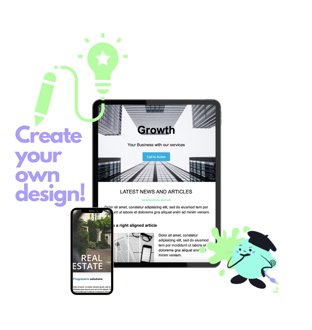
Refer to these layout samples for inspiration: A single-column layout is ideal for simplicity and readability, making it easy for readers to focus on your message. A two-column layout provides a balanced approach, allowing you to present multiple pieces of information side by side. A modular layout offers flexibility, with different sections that can be easily rearranged or modified. These samples can serve as a starting point for your own designs, helping you create a layout that meets your needs.
11. Newsletter Creative Design Tips

Inject creativity into your newsletter with these tips: Use unique fonts and typography to add character and distinction to your content. Incorporate illustrations and custom graphics to enhance visual appeal and support your message. Experiment with animation and interactivity to create a dynamic and engaging experience. Creative design can make your newsletters more attractive and memorable, helping you stand out in your audience's inbox. For more creative tips, check out the UseINBOX blog.
Newsletter Logo Ideas and Online Design Tools
12. Newsletter Logo Ideas

Your logo should be a reflection of your brand. Here are some ideas: Use your brand's icon or mascot to create a visual link between your newsletter and your overall brand. Incorporate your tagline to reinforce your brand message. Experiment with different shapes and styles to find a design that is both distinctive and versatile. A well-designed logo can enhance your brand identity and make your newsletter more recognizable. For more logo design tips, visit UseINBOX's newsletter design page.
Additional Design Considerations
14. Newsletter Ad Sizes and Placement

Including ads in your newsletter? Consider these sizes and placements: Banner ads, placed at the top or bottom of your newsletter, offer high visibility. Sidebar ads, positioned alongside your content, provide a secondary focus without overwhelming the main message. Inline ads, integrated within your content, offer a seamless experience that can enhance engagement. The placement and size of your ads should be carefully considered to ensure they complement your content without detracting from it. For more tips on effective newsletter advertising, check out UseINBOX's resources on email marketing.
15. How to Design a Newsletter Step-by-Step

Follow this step-by-step guide to design your newsletter: First, define your goals and audience to ensure your newsletter meets its objectives. Next, choose the right template to provide a structure for your content. Customize the template with your branding, including your logo, colors, and fonts. Add engaging content, such as articles, images, and call-to-action buttons. Finally, test and optimize your newsletter to ensure it performs well across different devices and email clients. This step-by-step approach can help you create effective and engaging newsletters. For detailed guidance, visit UseINBOX's step-by-step guide.
16. Newsletter Layout Ideas for Different Niches

Different niches require different design approaches: E-commerce newsletters often focus on product highlights, with images and descriptions that encourage purchases. Blog newsletters typically summarize recent posts, with links to full articles. Event newsletters may include schedules, RSVP options, and event details. Tailoring your newsletter layout to your specific niche can make it more relevant and engaging for your audience. For more niche-specific ideas, visit UseINBOX's blog.
Enhancing Your Newsletter's Subscription Design
17. Newsletter Subscription Design Tips

Make your subscription design inviting: Use clear and compelling calls to action to encourage sign-ups. Offer incentives, such as discounts or exclusive content, to entice new subscribers. Keep the subscription form short and simple, asking for only the most essential information. An inviting subscription design can increase your subscriber base and enhance the effectiveness of your newsletters. For more strategies on optimizing your subscription design, visit UseINBOX's signup forms page.
18. Newsletter Subscribe Design Best Practices

Ensure your subscribe design is effective: Place the subscription form prominently on your website, such as in the header or footer. Include it in your email signatures to reach a broader audience. Use pop-ups or slide-ins sparingly to avoid annoying visitors. Following best practices can help you create an effective subscription design that grows your audience.
Visual Elements and Graphic Design
19. Newsletter Graphic Design Elements

Incorporate these graphic elements for a polished look: High-quality images and illustrations can enhance your content and make it more visually appealing. Custom icons and buttons can add a unique touch and improve navigation. Consistent color schemes and fonts create a cohesive look that strengthens your brand identity. By incorporating these graphic elements, you can create a professional and attractive newsletter.
20. Newsletter Design Software Options

Creating an effective email newsletter design requires a blend of creativity, strategy, and attention to detail. By understanding the key elements of design, experimenting with different layouts and formats, and using the right tools, you can create newsletters that not only capture your audience's attention but also drive engagement and achieve your marketing goals. Remember to keep your audience in mind, continuously test and optimize your designs, and stay updated with the latest trends and best practices in email marketing. For more insights and tools, visit UseINBOX.


